Share This Article
The mobile web has had quite a surge over the past 10 years. Starting with just 4% of visitors on the web being on mobile devices in 2010, we’ve seen that percentage climb until it finally beat desktop in November 2016. Aside from some minor fluctuation, mobile devices have held the title of king of web browsing since then, and that isn’t even including tablet devices (which have held single-digit percentages consistently).
We’ve seen sites go from pinch-and-zoom, to having stripped-down “mobile-optimized” versions, to apps and more. Designers frequently take a mobile-first approach now, putting serious effort into ensuring that the most popular method of accessing the web has the best experience possible. Search has even seen some changes, with SEO copy being crafted to focus on voice-based search. E-mail has seen growth in mobile, too, with mobile devices overtaking desktop for sending & receiving email.
Let’s explore the mobile experience on the web, and important considerations for communities on mobile before we get to ways to improve your mobile experience.
How mobile users utilize the web
First and foremost, mobile users are always connected. Our smartphones are attached to us at the hip almost literally, and we’re constantly checking notifications, playing games, settling debates, taking pictures, and more. Most importantly, we’re interacting with each other.
There are 2 important aspects of mobile device use that are extremely relevant when it comes to discussing communities: the second screen experience and skimming vs. reading.
The Second Screen Experience
The second screen experience refers to people utilizing smartphones & tablets while watching TV & movies. They chat with friends on social media, look up actors and information, research products on commercials, and even do casual multi-tasking.
Sports especially gain a boost from the second screen experience. If multiple games are on TV that the watcher wants to keep an eye on, rather than flipping back and forth between channels, they’ll prioritize one to the main screen and another to their mobile device.
Online watch parties, reactions via social & communities, and even participating in voting & contests are all common with the second screen experience.
Skimming vs. Reading
Even though some smartphones have the screen size of a small paperback, that doesn’t mean that users of smartphones are absorbing information with the greatest amount of detail. In fact, given what we mentioned in the second screen experience, most users will skim as they scroll through content.
The reason behind this is murky, but it can be inferred from multiple observations. One is that mobile device use is often tied to environments where the ability to focus is limited, such as the above second screen experience, while eating dinner, out for drinks, or as a distraction from another task. Second to that is the goals of use: finding something specific (such as a factoid or guide) or casual browsing (typically on social media or other online communities) with no specific goal in mind.
Important features for mobile users on the web
While you want to ensure mobile users have access to everything desktop users do when it comes to the web, mobile actually provides some additional advantages over desktop that lends itself well to an expansion of features, rather than a reduction.
Notifications
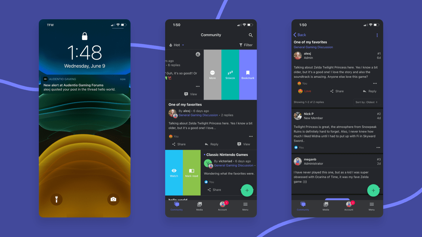
Notifications are by far one of the most important features for a mobile user. Rarely will someone sit on their mobile device and hit refresh to look for updates. They especially won’t drill down to the specific areas they are interested in repeatedly to see if something is new. Instead, mobile users expect to be able to subscribe to what is relevant to them.
Notifications can come in a variety of forms and depend on the type of content. Personal messages, replies and urgent alerts typically benefit from utilizing push notifications on the device itself. Alternatively, email can be used, but not everybody gets notifications on their phone for their email (especially if they sign up for your website via an address they use specifically to reduce spam to their “primary” email address).
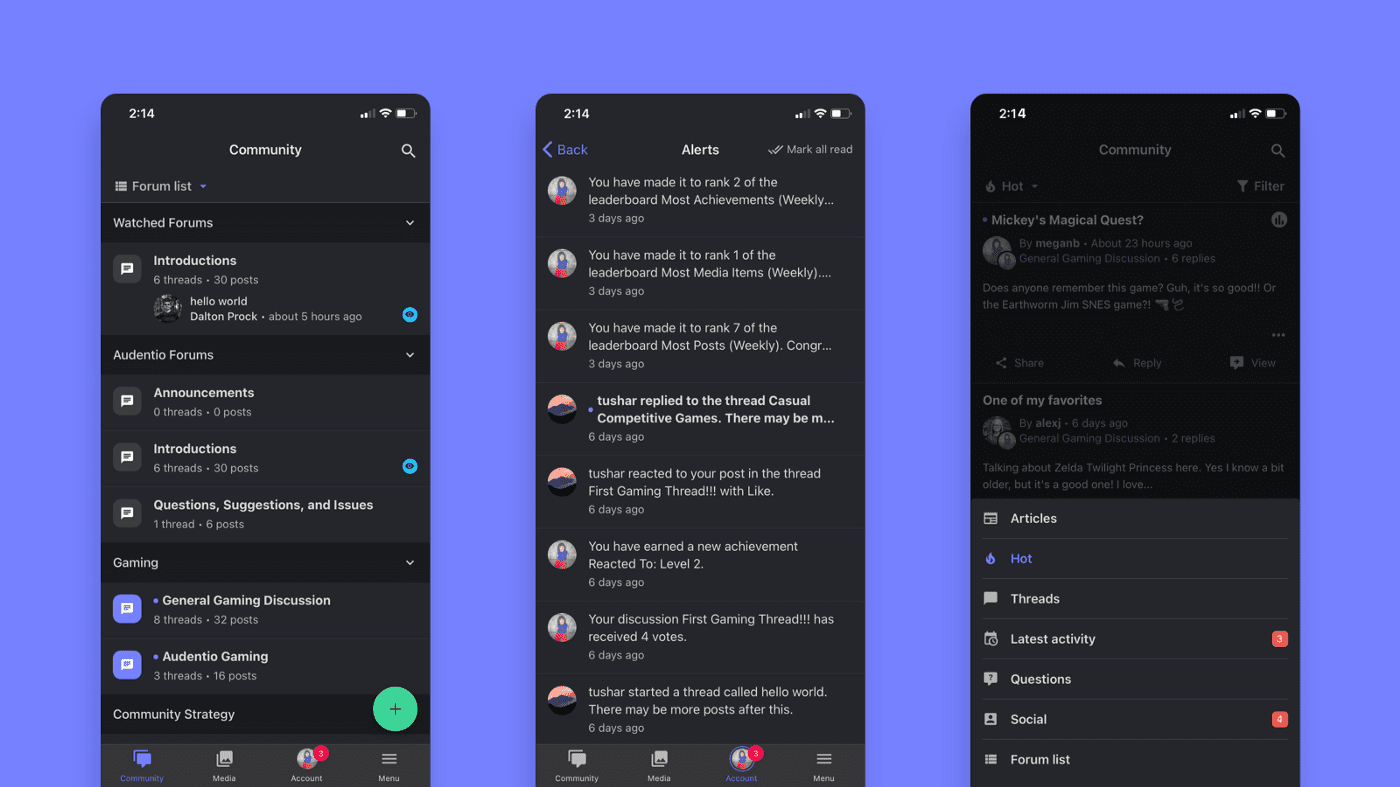
They can also come in the form of a customized feed and an alerts feature on the website or community. This is great for subscribing to content, providing a slim digest available in one place.
A familiar experience
Mobile interfaces are vastly different from our typical desktop experience. Iconography is king with mobile devices lending themselves especially well to condensing text down to an easily-understood icon. A hamburger icon for a menu, a bell for notifications, gear for settings, and a thumbs up or heart for likes. Going further, gestures such as tap & hold, swipe, and more can also be useful as far as interactions with your community go, but you may have limited ability to implement them depending on the platform and devices a visitor is using.
Reducing information overload
On a larger screen, users have a lot more screen real estate to work with. If you try to place everything from a traditional desktop web experience on a mobile device, you’ll end up with a lot of users missing out on what they are looking for. It is absolutely critical that information be condensed and prioritized. A headline, date, and very brief summary will have plenty of impact vs. a headline, date, full paragraph, and the first few comments, for example.
Fast load times & responsiveness
Mobile devices themselves are exceptionally powerful and users expect a certain level of responsiveness when interacting with something frequently. Moreover, ensuring that a website loads fast on a variety of connections and devices is absolutely crucial no matter what device the visitor is using.
How do we use this information to craft a great mobile experience for our communities?

With mobile users taking up such a large percentage of web traffic, community managers need to do everything they can to ensure a great experience or they’ll lose out on valuable activity and membership. Below are a few things to pursue in order to enhance the mobile experience for your community.
App vs. Website
One of the greatest debates over the past few years is whether or not your website should also offer a dedicated app. For communities, this is an especially important decision to make. It could be simplified by looking at the size and frequencies of interactions of your community. Larger communities with a lot of activity can benefit greatly from a dedicated app that utilizes existing app standards.

Essentially, you have to consider the benefits an app provides: Do your users need push notifications, quick access, familiar app-style interactions, or offline access? An app may be for you. However, you should keep in mind that a good UX on mobile can be accomplished via a website, too, and a quick study of your analytics will show whether im you’re missing out on mobile users.
Another point to consider is the cost. A well-crafted app is not cheap, and the value it provides may not be enough depending on the size and needs of your community. You can also explore PWAs (Progressive Web Apps), should your budget be limited and you just want to dip your toes into the app world.
Focusing on what matters
As we noted above, keeping your mobile experience trimmed to the specific goals of your community is crucial to ensuring members stick around and check back regularly. Making it easy for users to find information (via search and at-a-glance browsing), skim (utilizing headlines and activity states to help denote priority) and interact with your community (clear and simple ways to react and respond to content) should be your focus when enhancing the mobile experience. Don’t overwhelm your visitors with extraneous information, but make sure that whatever they might want is accessible. A good rule of thumb is this: Think about the top 1–3 things you want visitors to do when visiting and make sure that is prominent. Everything else should be lower in priority. Don’t forget to take a look at your analytics to see what areas are important to your visitors! Heat mapping can also be of benefit to determine importance.
Optimize, optimize, optimize!
Speed is the name of the game in the mobile world. Information is already at users’ fingertips and your goal should be to make sure that information can be accessed as fast as possible. Keep your overhead slim and avoid loading anything not necessary for the mobile experience; serving images properly sized for mobile devices, reducing the delays in rendering due to javascript, fonts & css, and smoothing out transitions will all help create a positive, speedy experience for your mobile visitors.
Paired with that should be a consideration for the hardware the mobile user has. Avoid anything that will make heavier use of the CPU so your community feels snappy as they scroll through and interact with it. A specific consideration should be made for animations: Avoid detailed animations whenever possible, and stick to the simple animations users expect, such as button presses, expanding sidebars & content, and ensuring modals pop in and out quickly.
Final considerations for mobile experiences
If you’re stuck trying to decide what direction to take with your mobile experience, take a look at what you use frequently for inspiration. What do you like or dislike about your favorite apps and websites on mobile? If nothing else, consider surveying your community to see where the pain points are. After all, they are the ones who will be using it and have perspectives you may not be aware of as an administrator.


