Share This Article
If you aren’t thinking about website accessibility, you should be. Everyone should have at least a basic level of accessibility enabled on their community platform. Accessibility isn’t just about making your community useful for visitors who are blind; there is a wide spectrum of vision impairments, as well as mobility and mental impairments that create a need for an accessible community platform.
Why should I care about accessibility?
By caring about users with these impairments, you’re tapping into a greater audience. Parents shopping for their children (and vice versa), students researching a topic for a class and more are all plausible scenarios, but ultimately, your community’s content has value, and is worth putting the effort into accessibility. By creating an accessible community, you create a larger, more inclusive community that has more thoughts, questions, and answers being shared.
The kinds of impairments users may have and how people with them use the web
In order to understand how to make your community accessible, you should have a basic understanding of the various impairments that your visitors may be afflicted with. Let’s step through a variety of impairments to understand them, and how people with them use the web.
Vision Impairments
While most might consider general blindness to be the chief impediment to using the web, it is by far not the only one as it pertains to vision. Color blindness affects a great number of people in the world, and must be considered when planning your design. Beyond that, you’ve also got motion blindness, motion sickness, and multiple forms of partial blindness.
Blind users utilize screen reading software to browse the web, which does exactly what you’d expect: reading the text of a website aloud for its users. There are also specialized devices that lift pins to create hand-readable braille text, which is important for blind office workers, as well as those who also have hearing impairments.
Partial blindness can range from spots blocking vision, to even blurry vision requiring either glasses or other assistive devices. Users with these impairments may use special stylesheets, increase the zoom factor in their web browser, read in text-only mode, or make use of a simple magnifying glass style of device.
Color and motion blindness as well as those afflicted by motion sickness have fewer tools available to them. Some will utilize settings within the browser to help compensate for these issues, but those are few and far in between. Even more interesting is that a number of people with color blindness may not realize they have it, especially if they are in an older demographic before testing was common for it. There are extensions for browsers that can assist with this, but starting from the ground-up with these users in mind is a much more efficient way to ensure your content is accessible to them.
Mobility Impairments
While frequently overlooked, mobility impairments affect a large number of people who may visit your website. This can include limited limb and digit mobility, missing limbs, or even physiological and neurological issues that cause tremors or paralysis.
There is some fascinating technology available for users who are missing limbs or suffering from various forms of paralysis. Gaming has actually pioneered this in many ways, providing tools to allow users who can’t use their hands to make use of their feet or even eyes to control a mouse on a screen (take Stephen Hawking’s chair as an example of unique methods of user input). Many users in this situation also pair it with page/screen zooming to create larger targets for interaction (such as buttons and links), as their dexterity can be limited compared to a traditional user.
If a user has limited mobility, they’ll frequently make use of either a non-mouse pointing device (such as a joystick or trackball), or even their keyboard to navigate a website. On mobile devices, they may also utilize display modes that essentially cut the screen in half to limit the amount of reach necessary to interact with the page, or a stylus.
Users who suffer from tremors and users who have enlarged fingertips have one thing in common: They rely on websites that feature larger interaction areas for buttons that also have plenty of separation between them. In the case of tremors, there is software that smooths the motion of a cursor out to be a little more accurate, but even then they rely on generously-sized click targets in order to interact with objects.
Mental Impairments
There are numerous neurological and psychological impairments that can impact a users’ experience on the web. Many times we, as creators and community managers on the web, are already considering our audience and crafting the content to meet our target audience, but it goes even further than that. Ultimately, these users tend to make use of the web just like you or I would, but whether they stick around on your website depends on if you are able to cater to them.
Techniques to improve community accessibility
There are countless methods to improve accessibility. Books have been written about website accessibility, and the subject is continuously evolving. Below we’ll outline just a few things you can do to help visitors of all kinds utilize your website and why it is important. This is by no means an exhaustive list but a good way to get started.
Add a hidden “Skip navigation” and “back to top” button — This is one of the most useful tools for blind and keyboard navigation users on the web. Basically, this allows them to tab through the site, and before the navigation, allows them to hit enter once revealed to skip down to the content of the page. Back to top gives them an opportunity to do just what it sounds like it does; hit enter and it’ll take the user back to the navigation, ready to visit another page on the website.
Test your website for color contrast and color blindness visibility — Utilize tools like Chrome’s inspector tool, or WebAIM’s contrast checker to ensure that there is enough contrast between text and the background. Beyond that, there are numerous extensions for Google’s Chrome that allow you to test websites with various color blindness and vision impairments. Ensuring that everything looks good through all of these situations will make your website even more accessible to a much wider audience that may express an interest in what you’ve got.
Ensure your text is large enough to be legible, and choose appropriate fonts for body type — While you don’t have to (and shouldn’t) use 20 point font sizes for body text, you do need to ensure that it is perfectly readable to the largest group of visitors to your site. That also includes avoiding decorative fonts for body type, which can’t be stated enough. If you’re unsure, stick with the standards: Helvetica. Open Sans. Roboto. Arial. Verdana. Ensuring that your core typography is readable to everybody (and adjustable for the few who need to adjust it) is a simple thing, but has a great impact.
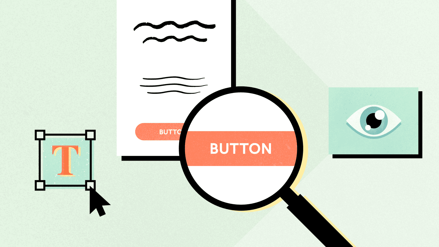
Size buttons appropriately, and ensure there is space between them and other interactive objects — You’ll want to make sure most buttons are at least 42px by 42px in size. Why? To ensure that people with mobility and visual impairments can actually tap the button when they want. This is especially important when pairing it with adequate whitespace, ensuring that visitors don’t accidentally hit the wrong button, and can recognize separation between the two.

Limit the amount of motion-based animation, keep it subtle, and (if possible) allow visitors to disable animation — For users with motion blindness or motion sickness, the worst thing you can do to them is force them to endure a lot of motion on your website. Those of us familiar with the modern web are fairly comfortable with animation, but not everybody can enjoy it. Keep it subtle, and if you must add something dramatic, make sure animations overall can be disabled right from the start. Even better? Make use of fades rather than changing position on animation.
Avoid flashing objects — Besides being annoying for many users, repetitive flashing animation has the potential to trigger seizures in those who are afflicted with them. People who suffer from anxiety and stress related impairments can also be turned away by the experience. We’ve come a long way on the web, having long gotten rid of the BLINK tag, but what seems like a great attention getter (a flashing alert) can also be a great way to push away repeat visitors.
Limit the maximum width of text area content (such as articles, forum posts, etc) — Screens are bigger and resolutions are higher than they used to be. Previously, you’d design websites to work with screen resolutions of 800×600 pixels. Now, we’re designing for 1920 effective pixels wide on screens ranging from 15” to 24” and even larger. Ever wonder why newspapers utilize a column layout for reading? It’s easier to read and keep track of where you’re at. The wider the paragraph, the more likely it is a reader will get lost or get frustrated. This is especially true for readers with attention disorders and shaking vision. Sticking to around 700–900 effective pixels wide (along with an appropriate font size) for a content area will help those users immensely. Additionally, avoid use of justified text; ragged right/left/center makes keeping track of line position much easier.
Embrace whitespace (unused space) and ensure that overall site spacing is conducive to denoting separation and hierarchy of content — Sometimes, people treat laying out a website like packing a box or playing Tetris; figuring out how to get everything to utilize the available space the most efficiently and getting in as much as possible. Unfortunately, the more you cram in “above the fold” (a holdover term from the newspaper industry meaning content that sits above the fold of the page or for a website, the content first visible without scrolling down), the less likely you’re going to be able to denote priority. As well, the more tightly packed content is, the harder it will be for users with certain forms of anxiety, vision and other impairments to absorb anything. Ultimately, you should consider what information is most critical on your website and prioritize it first.
Utilize proper semantic tags for content — Semantic tags (tags which convey meaning and intent) have been around for much longer than you might think; while most would assume that HTML5 was the beginning of semantic tags, in reality, there 11 key tags that have communicated important information in HTML for many, many years. H1, H2, H3, H4, H5, H6, OL, UL, P, EM and STRONG. Heading tags denote what the content is about and specify tiers, OL (and the subsequent LI tags) denotes that the list contained within is in a specific order, UL (and, once again, the subsequent LI) denote an unordered list, P breaks content into paragraphs (which is critical for screen readers vs. the BR tag), and EM and STRONG provide specific forms of emphasis for text content. If you only use a limited set of semantic tags, use these. Not only will your vision-impaired readers thank you, your search engine results will improve, too.
Make full use of alt-tags for non-decorative images, and avoid using images for critical text content — Alt-tags (as in alternate text that is seen by screen readers and search engines when an image can’t be viewed) should describe the context of an image. While you can also use figure and caption tags, alt tags provide a unique opportunity to help those with vision impairments and provide additional context to search engines. Avoid using them for decorative images though. A decorative flourish to add a little space between a paragraph and a headline has no value to blind users, so you shouldn’t use an alt tag for those (although utilizing alt=”” is perfectly acceptable). Finally, if you want a highly-stylized headline, use HTML, CSS and web fonts to create the look whenever possible over images. If a user can’t see any images and the text is in the image, then they won’t see or hear the text. Make sure all of your users can get the same important content as everyone else.
Utilize ARIA tags — ARIA tags are special properties attached to HTML tags that help provide more context to vision-impaired users on websites. A lot can be written about them, but an important focus when considering their use is whether the existing semantic HTML covers the context. If not, use them. You can read more about ARIA tags here.
What’s next for accessibility?
These tips are just a small part of a larger consideration to be made about accessibility. Each community has its own unique needs to consider and it is important that you and your developers understand the gravity of the work that can (and in almost all cases, should) be done in order to ensure you create the most accessible experience on the web for your visitors.
Accessibility is much more than what people would typically consider. It is more than ramps. More than braille on bathroom signs. More than widening doors for wheelchairs. Having an accessible presence on the web can help build relationships with a larger demographic of users who benefit from it than you might expect.


