Share This Article
We may have already made it pretty known with our recent article that big changes are happening at Audentio. We’ve strived to be innovative in the community space, product designers bringing complex but useful products to the forum space, and always pushing harder for progress. We’ve been making themes for XenForo and many other forum software for over a decade, and today we want to introduce the culmination of all our efforts over the last few years: AC.UI.
Where it began
We’ve designed and built themes from day one of XenForo’s release (for good ole nostalgia, take a look at our first theme). Theming has always been a core service at our company. We’ve released over 150 theme products for various forum software including XenForo, MyBB, vBulletin, InvisionFree, and more. We’ve also designed countless custom forum themes for our clients over the last decade or more. Our flagship theme and framework, UI.X, has been purchased over 10,000 times. Of course it’s been technically updated as new versions of XenForo release, but we’ve also made countless improvements. Visually it’s undergone numerous iterations to reach the point that it has.
But times have changed, and the need for a theme framework has become less important in some regards. These days, we are interested less in the millions of ways you can edit a theme – such as the case with our UI.X framework – and more interested in precisely how should a forum ideally present itself.
What is AC.UI?
AC.UI is our new take on what a forum interface should be, taking all the experience we’ve built up over the years into one theme.
While there’s still a basis in Material Design, which is how UI.X 2 was designed, we navigated away from the growing trend of everything having ‘chrome’: something we define by having shadows into something that is deceivingly simple but yet so meticulously considered and designed that it may be surprising to hear that we worked on this theme for a number of months.
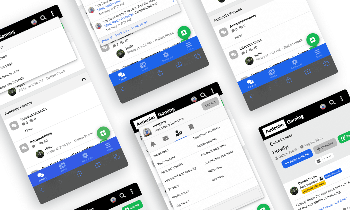
AC.UI isn’t strictly just a ‘skin’ or ‘theme’. The theme has technical overhead as we not only changed XenForo core settings and style properties, but also fundamental components from the base XenForo experience. By that I mean how we handled alerts, position of the page menu on mobile, a complete re-work of mobile navigation, more options menu to handle toggling sidebar, and many more details.
At the core, AC.UI is our most opinionated theme yet. We’ve made all the micro-decisions so you don’t have to. We questioned what is the ideal font size for metadata, the perfect configuration of colors for the best contrast, and what padding should be around every element for optimal visual hierarchy and legibility. We focused on space, minimizing clicks where we can, focusing on what users found to be the most useful, and brought those to the forefront, minimized decisions, and much more.
No detail was truly missed and I know we’re really talking a big talk here so I’ll do my best in summarizing what we really did in the making of AC.UI.
So what is really different with it?
Below, I’ll walk you through what is different with our theme and our rationale behind it. Again, there were so many micro-decisions to solve and discuss that summarizing thousands of hours will be a hard task. I’ll outline a lot of the major takeaways of what makes this theme unique.
In discussing the theme, we may mention another one of our products, Feeds. It provides the main experience of the front page with a hot (curated) feed and a number of other features. While AC.UI partners with Feeds and is what we think makes for the ideal community, AC.UI doesn’t require Feeds in any way and can be a standalone theme.
If you are curious in checking out Feeds, it’s in beta as of the posting of this article for a limited time and offered for free here with limited support.
Otherwise, let’s jump into the design.

Desktop Navigation
To start, navigation is the most critical experience to get right and we’ve definitely iterated on this and have changed our perspective along the way. We were once huge proponents of Material Design with their left-canvas menu and large search at the top. We discovered a left-canvas is the ideal solution for platforms, but when we’re designing for forums, keeping it simple is always best.
Mobile navigation
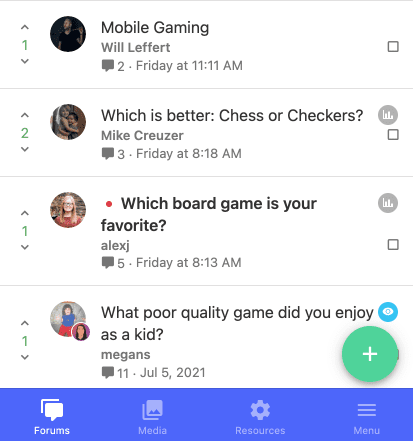
A huge quality of life improvement that we made was converting main navigation links to a bottom tab structure. This mimics what we’re accustomed to for app design and means that users don’t have to click into the off-canvas menu to navigate around.
Off-canvas menu
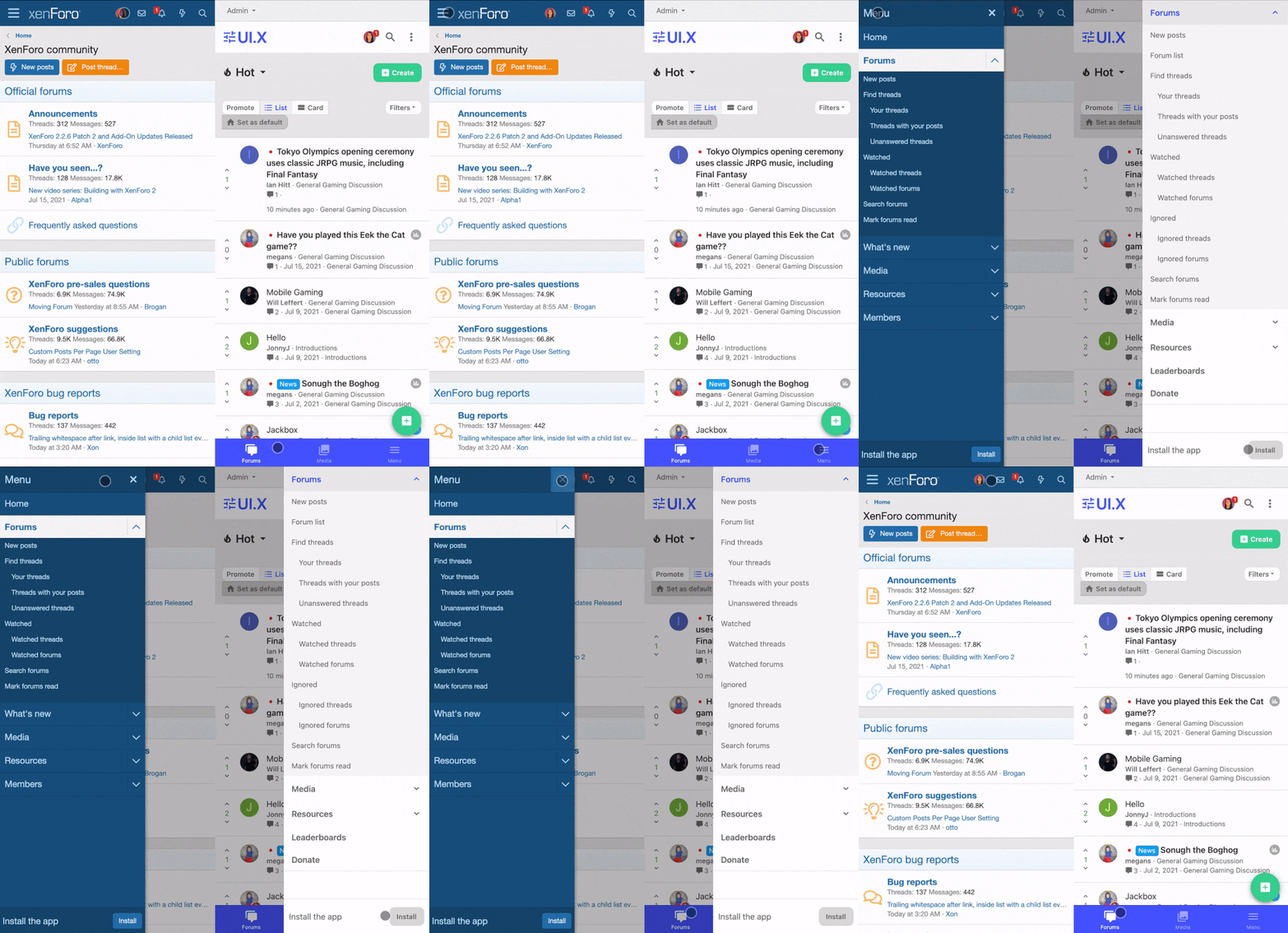
This is influenced by our new mobile navigation discussed above. In our goal of simplifying the top navigation for mobile, we also decided to remove the off-canvas trigger by the logo and instead have it one of the bottom tabs.
This was done for several reasons:
- Navigating on the phone, our thumb typically hovers near the bottom to scroll, to click back home, etc. It is a much more natural movement to click on the menu bottom right instead of stretching to top left.
- To continue, most people are right-handed and so clicking across the phone to navigate around was tedious for most. In the future we will add a setting for people who are left-handed to move this menu over to the left-hand side of the navigation.
- Logos often have a brand mark design. With an icon placed right by it, it can create visual disharmony between the functional icon and the logo.
- Not to mention, removing an icon can save on space overall.
Page menu
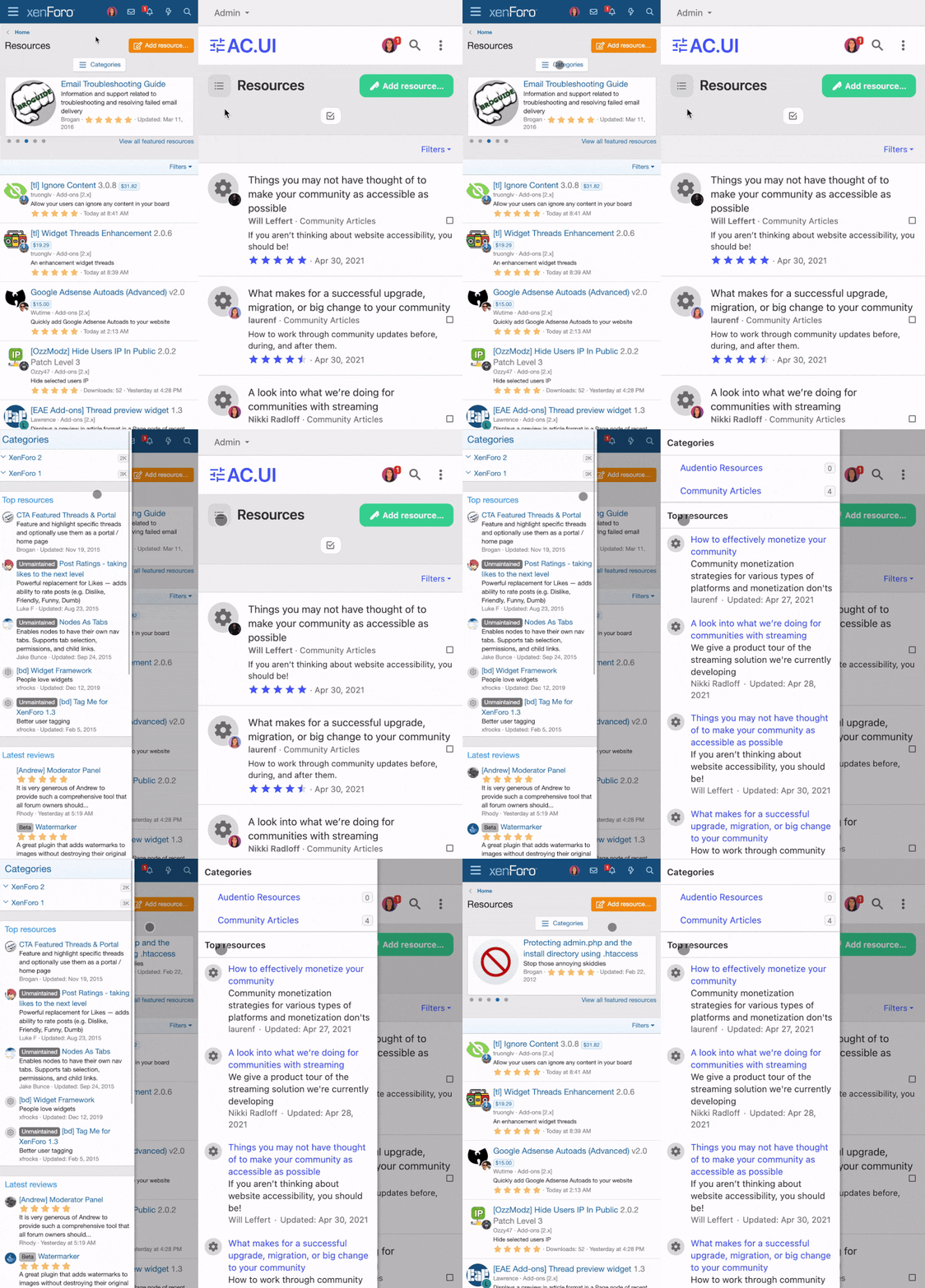
There’s several pages that require an on-page menu such as Resources or Media. On a desktop, this is a non-issue since there’s enough space left-side to accommodate it. On mobile, it becomes a button trigger for an off-canvas menu. While it’s a small improvement, we also changed the location of this page menu trigger.
- The button was adapted to a single icon that now resides left of the page title
- The trigger still shows an off-canvas menu but now can save on vertical space (an entire line)
Alerts and user menu
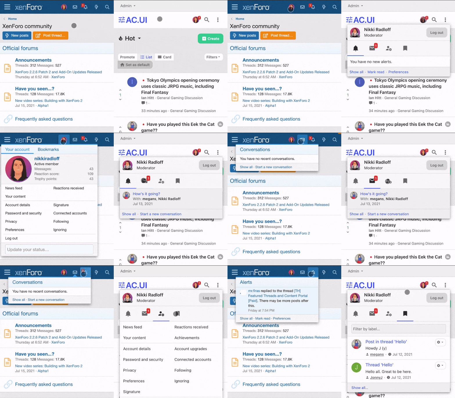
One of the most critical things we have changed is how alerts are handled and the user menu. By default XenForo has separate icons and menus for the user, conversations, and alerts. To achieve a cleaner navigation and avoid a large amount of icons that need their own touch triggers, we consolidated it into one menu.
- When you have an alert (whether it is conversation related or a new alert) the user icon will show the alert number.
- Alerts, conversations, user menu, and bookmarks are now easily centralized into one tab menu.
More options
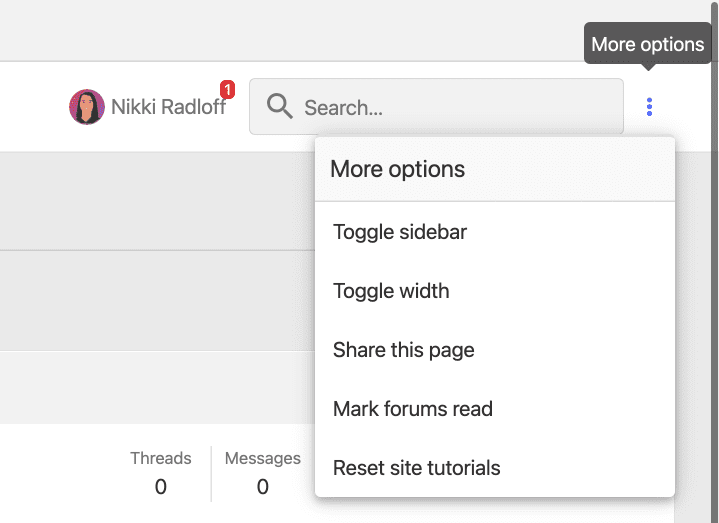
We introduced an option menu to the navigation to consolidate a few features.
- Toggle sidebar: this is a feature that is native to UI.X and not base XenForo which allows users to collapse the sidebar. We typically had an icon above the right sidebar to signify this but the first issue was that the icon was never descript enough to be clear on what it does. The second point was that it took up valuable space near the main page actions when it’s really a secondary feature. Now the action can use text, making it clear on what it does, and also save space.
- Toggle width: this is a feature that is native to UI.X and not base XenForo that allows the page width to be contained or full width depending on user viewing preference. This still remains in the standard footer location that we’ve had in the past but worth duplicating as it’s a main page action and can be convenient to change without scrolling down the page.
- Share this page: this widget in base XenForo typically displays in the sidebar. The sidebar should only be reserved for critical content and sharing the page falls to more secondary. It’s a nice feature to have, hence us moving it to the ‘more options’ menu instead of hindering the sidebar.
- Reset site tutorials: this is not handled by our AC.UI theme but instead by Site Tours, an onboarding add-on that we created to guide new members when first visiting the site with helpful prompts. You can learn more about Site Tour and our other suite of products here.
Mobile message layout
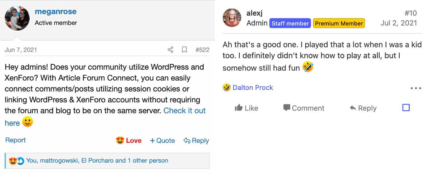
Forums are content-heavy by nature. When you have so much data to consider like username, user group, date of post, post content, and post actions, improving the design of such a critical component such as a message card can be difficult. We tried to solve in a variety of ways:
- Instead of having an entire bar in post content dedicated to displaying the post date and number, we moved that information to the right side of the post bit. There was room to spare and now post content is free of any meta data.
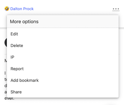
- We introduced a more options menu to include secondary actions and moderator actions.
- Reaction bar is chromeless saving on vertical space and is in-line with the more options, again saving space.
Conclusion
AC.UI is a culmination of years of hard work continuously improving and learning to reach what we think is the best experience for XenForo. And because we want to share our best work with you, we’re offering AC.UI free for a limited time. You can learn more about the theme and how to receive it here.
We are constantly striving to improve what we’ve built before, trying to push the needle further by giving users what they expect from other modern platforms and offering the experience that improves engagement numbers across the board. We are very proud of this, and hope you enjoy it.
