Share This Article
Online communities, specifically forums, are struggling to keep up with the modern user experience that large social media platforms provide. It has been a trend for a long time, but lately this trend has been more obvious than ever to the point where some smaller communities are giving into the Facebook Groups and Reddits of the world. The simple fact is that these large social platforms are far too convenient.
As we all know, big tech social media platforms come with many drawbacks. Some of those include:
- the struggle users have in forming deep, meaningful connections within the context of a broad social environment
- the feeling of being monetized, as there are ads everywhere and the recent scandals with data privacy — users prefer supporting their own groups instead of large tech and marketing companies, as a general rule
- inability for community managers to design and develop the platform specific to their community’s needs
- content on social platforms are almost always ephemeral, content is new every day and this is by design, so organizing content for long-term or detailed use is extremely difficult
In this article, we are going to focus on the user experience for these small platforms. Specifically, how users are discovering content, as well as finding a sweet spot for what is reasonable to accomplish at a smaller scale. Ultimately, we all know what features we want for our online platforms if we had unlimited time and money, but we know that to gain those features, we would ultimately be forced to allow social media and large tech to govern our community members, monetize them how they want to, and control the entire playing field. This article is for those who do not wish to go down this path or simply cannot.
We will try to address this problem within the context of your average small to medium sized online community forum. In all, platforms and communities who manage, build, govern, design, and grow themselves independently.
Comparing large social media platforms to small communities
Infrastructure
To begin, lets start with comparing infrastructure in general. Large social media platforms benefit from neural networks to curate content, have advanced media management tools such as filters and the ability to upload large videos, and, of course, the simple fact that many of these companies are multibillion dollar behemoths that can throw money at their platforms to focus on every little feature and detail. Online communities in contrast often have a very limited budget, use their own server infrastructure, and rely on many other third-party tools and developers to accomplish what they need.
Utility
The fundamental utility between the two platforms vary as well. Smaller communities will typically focus on a specific topic or type of person, with the purpose of sharing relevant information, along with socializing with others interested in the topic. The conversations discussed can be valuable over a longer period of time because they are a dedicated space for that specific topic and tend not to be too broad or diverge. On social media platforms, the topic of discussion varies significantly.
For example, let’s compare an example of the typical utility between the two types of platforms. An Instagram user might, for example, make a catchy, non-informational caption with a photo of their pet for the purpose of receiving reactions and comments. In contrast perhaps, the needs of a small community such as ChameleonForums.com, may require their users to provide a breed, age, and detailed photos as one of the many primary utilities of this platform could be medical advice. Such would require far more precise information; information that may get lost in a comment on Instagram. Also, in being specific, this information stands to help future people that have the same issues. Instagram for example is not indexed in Google, whereas forums often are.
This distinction is important. It shows the value that the two platforms have and that they are unique and their own. Each platform has their own utility which may vary, but in general, social media platforms are more for entertainment and social purposes, whereas online communities are where people congregate when they have something they wish to accomplish or answer. This is at least how we define the two and how I have seen the utility of these platforms effectively used over the last 20 years.
Comparing the user interface and experience of online forums to social media platforms
There are two clear and fundamental differences between the core experience and user interface for these two types of online experiences:
- How content is organized and discovered
- The detail and depth of discussions on various topics
There are plenty of other differences, but within the context of user experience, these two will suffice.
How content is organized and discovered
Social media sites rely on neural networks for organization of content which has proven to be useful in certain settings and not useful in others where detail, authority, and expertise are more valued than whatever is “trending.” Forums have essentially forced their users to help organize content, use specific text formatting, merge duplicate ideas and similar content, and be more rigorous in all aspects of discussion.
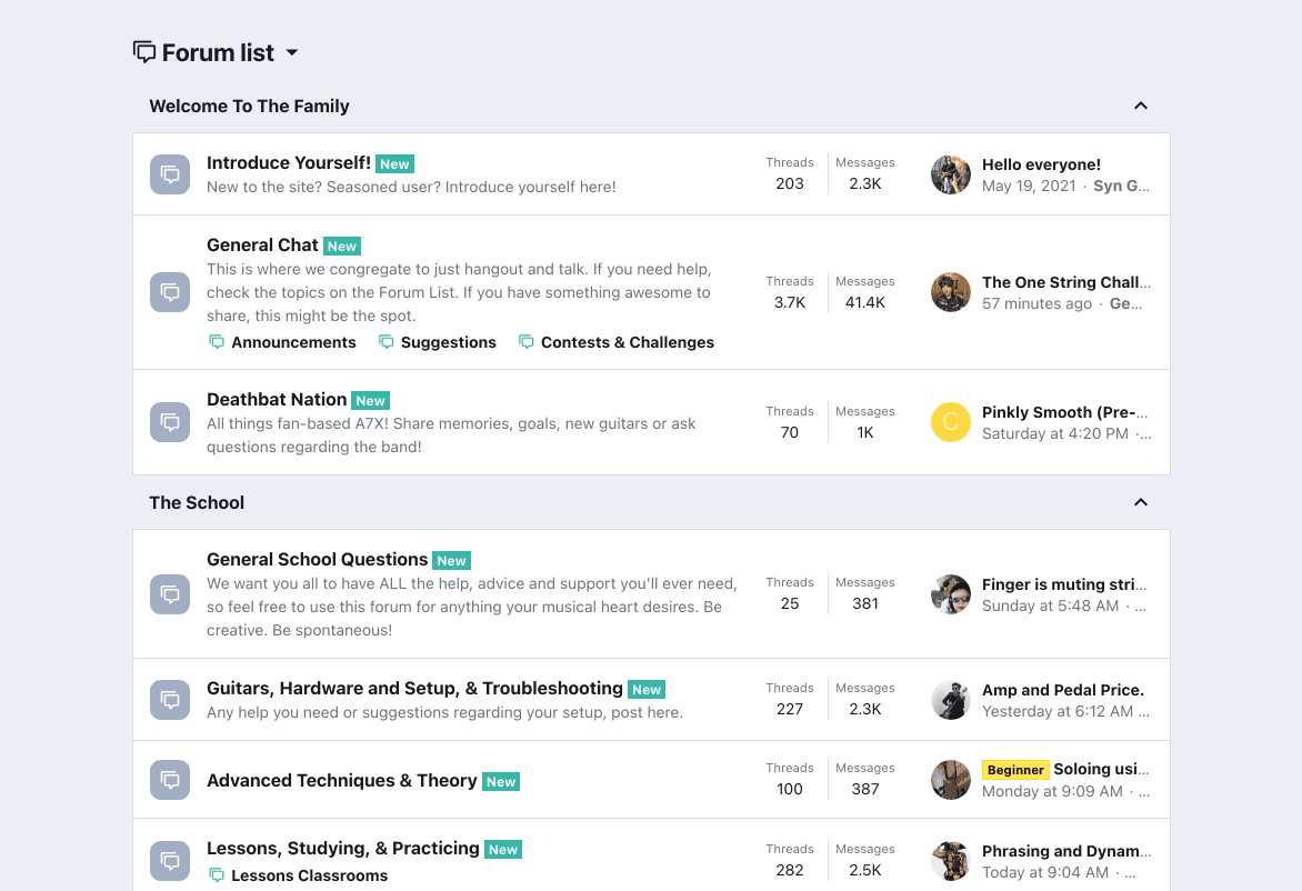
That said, this style of overly organizing content on forums have their drawbacks as well. We call this style of organizing content on forums, the folder-style organization of content, a “traditional forum experience.” The main issues with the traditional forum experience (in other words, folder-style organization) are as follows:
- Requires users to have to know the site intimately and where the content they are looking for is (often behind ambiguous titles that the site founders thought would be clever)
- Users need to learn how content is organized so that they can contribute
- Multiple clicks and taps are needed to move between sections of the site
- State of the content is ambiguous
- Context of the content is unclear when you only have a title to work with
All-in-all, there are barriers for users to both find and create content. This can make onboarding new members more challenging since the structure involves a learning curve and adds to the intimidation of participating. Having a site where the user needs to learn how to use the platform, or even having moderators or annoyed members complain to that user, can cause new members to drop off the site quickly after joining. Any existing members who did take the time to learn how to use the site may be averse to change because it would involve additional learning time.
The detail and depth of discussions
Online communities tend to be more detailed in their responses to an issue or question, whereas social media sites often err on brevity or adding a small snippet of extra information to the discussion. Forum users tend to need to read all the replies before contributing to the discussion, whereas social media sites offer a more convenient experience for users to add a small emoji or brief comment. There are exceptions, but in general this is a clear distinction.
The core problem
Due to these main distinctions, social media sites have been able to benefit from offering a user experience that is quicker and more intuitive in general. By this definition, users of social media platforms are not required to organize their content and participants of discussions do not need to offer detailed responses to the original posts and discussions. Social media platforms in general are able to appear more modern and more enjoyable for the simple fact that they require less mental effort from the user.
So, the core issue and core problem we wish to address is this:
How can we allow small communities to improve their user experience and discoverability of content that can rival social media platforms? Additionally, how can we make content more attractive and engaging while not changing the fundamental value that detailed and in depth discussions offer?
The approach
There are many software platforms out there that service small communities. In this example, we are using XenForo, so some of these details may only apply to XenForo. This should not take away from the key ideas, however, and these ideas can be applied to any forum or community platform.
To begin, we set out to rethink the benefits of forums and the benefits of social media sites which we discussed briefly above. This was not the first time we set out to solve this. We have been working on this specific issue for years. We couldn’t solve all the things that forums lacked over social media, as whatever solution would be impractical to implement by resources and infrastructure needs alone.
The goals we had for this more specifically are:
- Make the experience of both discovering and creating content more attractive, faster, and engaging
- Ensure the heart of small communities stays in tact by not diluting the experience with easy ways to ruin its overall mission.
- Staying true and having a supportive experience that which is required to have real and useful discourse online
The specific solution
The solution we came to was based on all we’ve learned about forum structure and user experience from our multiple attempts to solve this issue, as well as what we think the ideal community experience should look like. We wanted an organized way for users to quickly be able to find and create content, ask a question, talk with other users about topics unrelated to the forum subject, and even a space where more traditional forum users will still feel at home using the changes we made. We wanted the pros from social media platforms, while not removing the needs of small communities.
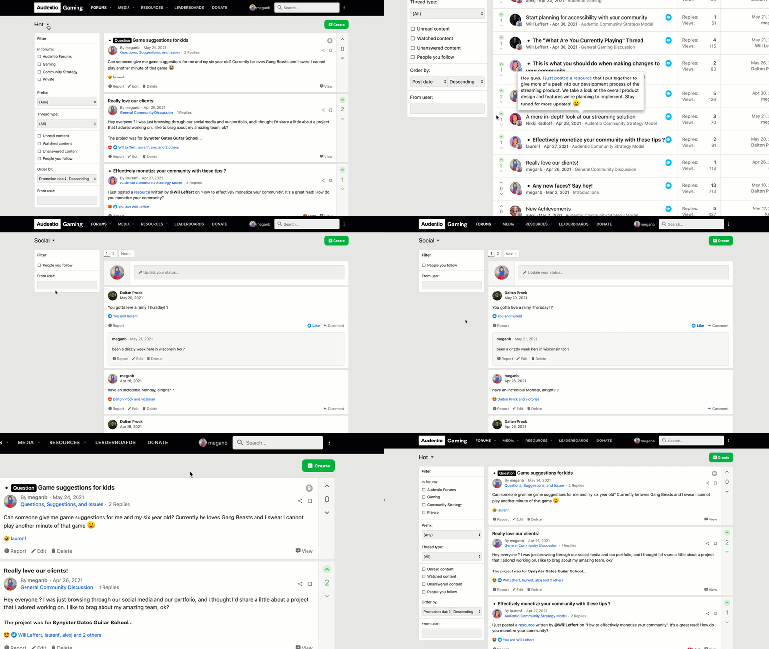
For those who are looking at a native app solution, we have that here as well:
View a live demo of an example experience here.
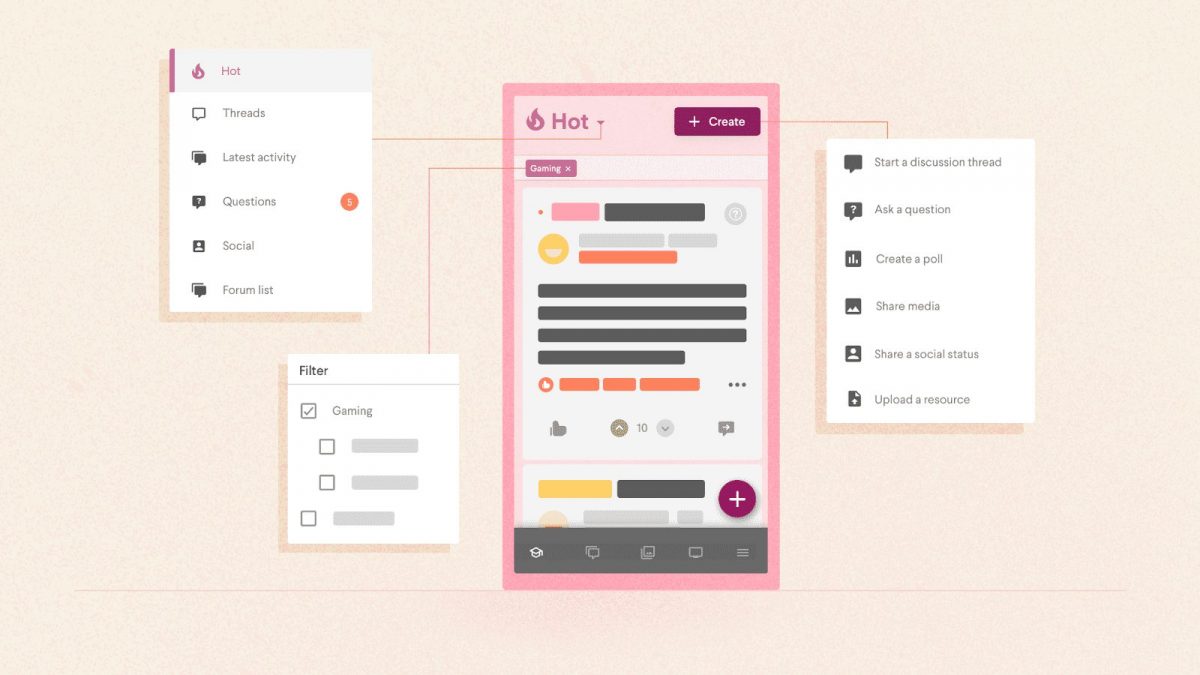
Our solution included critical features we call the cornerstones of an improved forum UX:
Feeds list
The main idea behind this experience is that you have different types of users who use the same community platform in different ways. Many platforms have attempted for years to merge these utilities into one core experience. Our approach was to focus on each core utility in turn. Give each core utility of the platform its own dedicated space.

While we support custom feeds of course, here are the most critical and default feeds we think every community should have:
- Hot (Curated, described below): Used for the staff to hand-pick and/or a calculated algorithm to intelligently pick the trendiest content into a single content list. This is typically best for community index, and for guests to see the best of the best immediately. However, this content may not be what core users of your platform will want to exclusively see after a while, so having more options is critical.
- Threads or Discussions: New threads, typically chronologically. We prefer to call these Discussions, depending on if the community has been using the phrase “Threads” successfully to date or not.
- Latest activity: All major activity on the site such as replies and comments, new discussions, new questions, new media, new guides and resources, social activity, etc. — power users and core community members of your platform may prefer this, with their own filters applied.
- Questions: Specifically for those with unanswered questions or recent questions in general. This helps to ensure that everyone with a question gets an answer, and if a user is in the mindset of seeing who they can help today, they have a specific experience just for that.
- Social: A special area for social activity that does not need to be on topic. Users can share images and video in an Instagram-style fashion. Forums have notoriously ignored the social engagement aspects of their community. This feed offers a special experience for those wishing to socialize.
- Forum list: The traditional OG of finding content is still here for those who wish. There are many users who prefer the “traditional forum experience” and we would be unwise to ignore them!
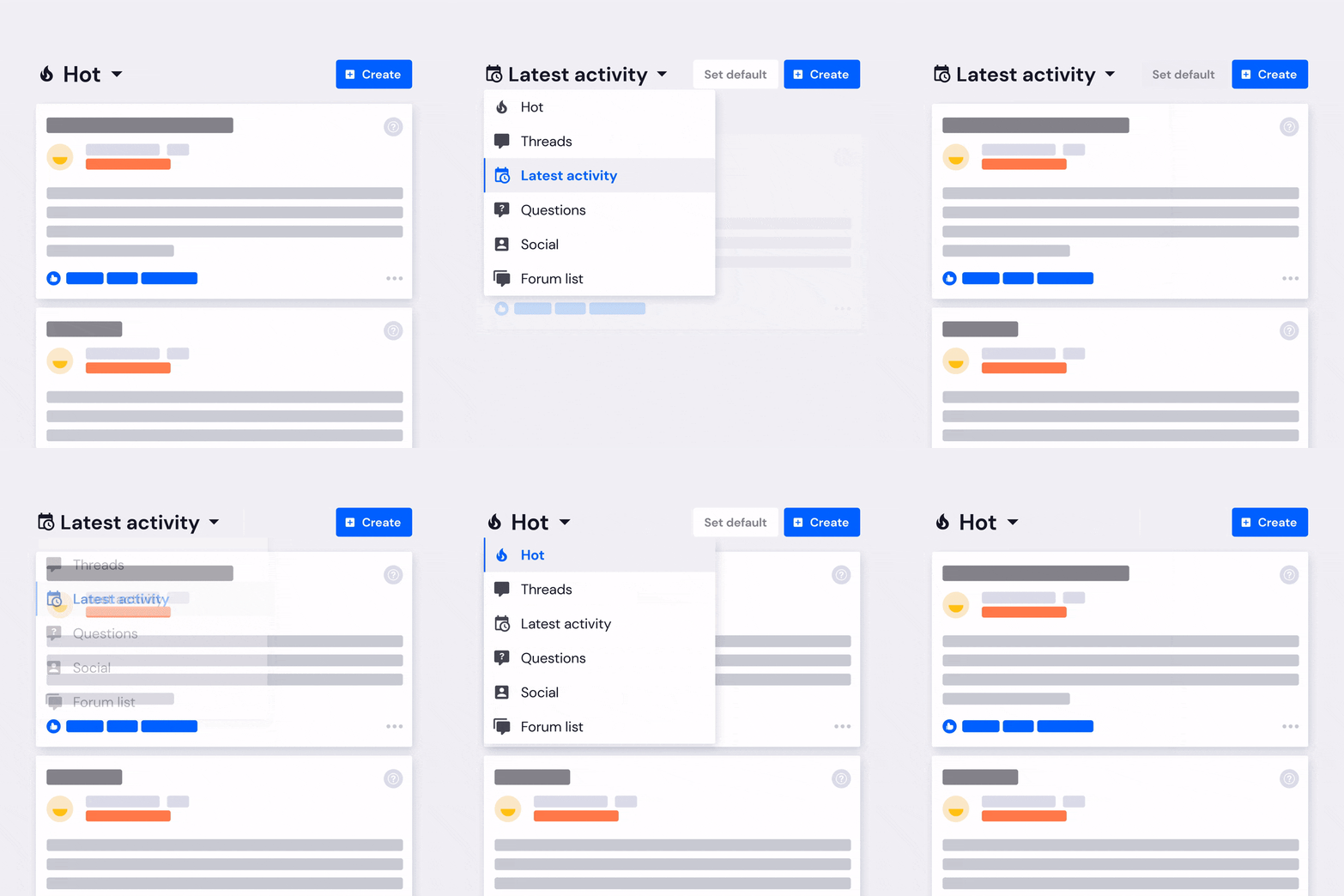
The current UX is a dropdown experience, though we think intelligently showing the most used by the community and eventually quickly show the top 2–3 for each specific individual will be an improvement here. Showing one at a time is not ideal, but is practical for right now.
Setting a default feed
Each feed will have the ability to be set as an individual users default feed, so that the user will always return to that feed rather than having to navigate to it every time they visit the site. This can be changed over time, and the experience prompts the user based on activity.
A universal create button

Most users, when it comes to creating content on the community, probably only have one or two things they wish to do on that day, give or take. So standardizing this list into a single call-to-action seems intuitive. It may show through our research that users are creating more content, such as polls for example, when they had previously ignored this type of content in the past.
A curated “Hot” feed
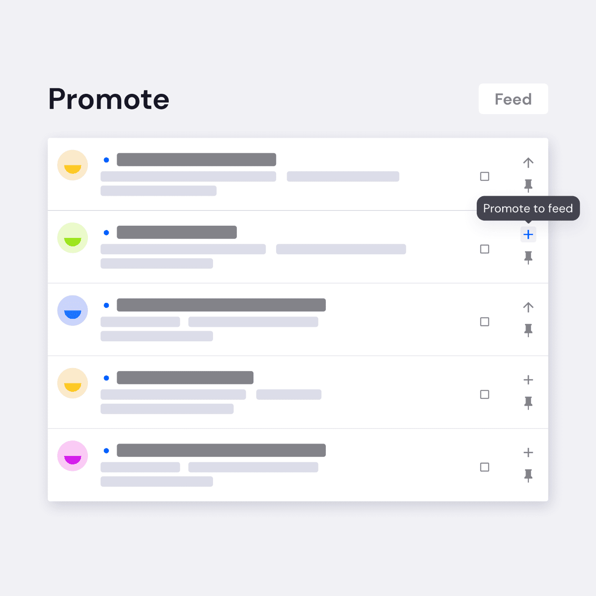
Though mentioned above, it is worth drawing extra attention not just to the idea of having this content, which is probably intuitive on its own, but the core idea behind how to make keeping this up to date, effective, and convenient for the editorial, community manager, and moderator teams.
- There are permissions supporting who can promote to the Hot feed. There are also permissions for who gets to have final say on what is published to the Hot feed.
- We offer a promotion list which shows all the trending threads in one place for convenience of whoever is looking for fresh content to promote.
- We built a way to work through this list programatically to automatically feature content at configurable intervals. The system checks if that thread was promoted recently and if so will skip to the next item in the list.
- Automatically promoted content can go into the moderation queue, optionally, requiring someone with permission to manually approve it before being published.
- Our friend Arnold Kim at MacRumors.com conveyed to us his concerns with having a Trending list as a homepage due to the fact that when a user would come back to that list, the order of the content would appear scrambled and not preserve any concept of chronological order. Thus, this system is designed to be top to bottom in a first in, first out format.
- You can both sticky and bump content to the top of any feed, ensuring its visibility for important pieces of content.
Infinite scroll

We remove pagination in favor of a load more button or infinite scroll, so users can continue to scroll to find more content. This is a very standard experience on social media platforms, but rather uncommon on forum platforms. We have a load more button, as the technical reasons why pagination are required should not inhibit the user from finding more content to consume.
Real-time loading
To provide a “real time experience” with a faster interface. Most forums still are server-side applications, as opposed to the modern client-side single page application experience, which has a far snappier feel to it. XenForo, being such a platform that is rendered through PHP on the server, had limitations in how we could implement this ideally, but we did what we could and will improve the real-time experience moving forward.
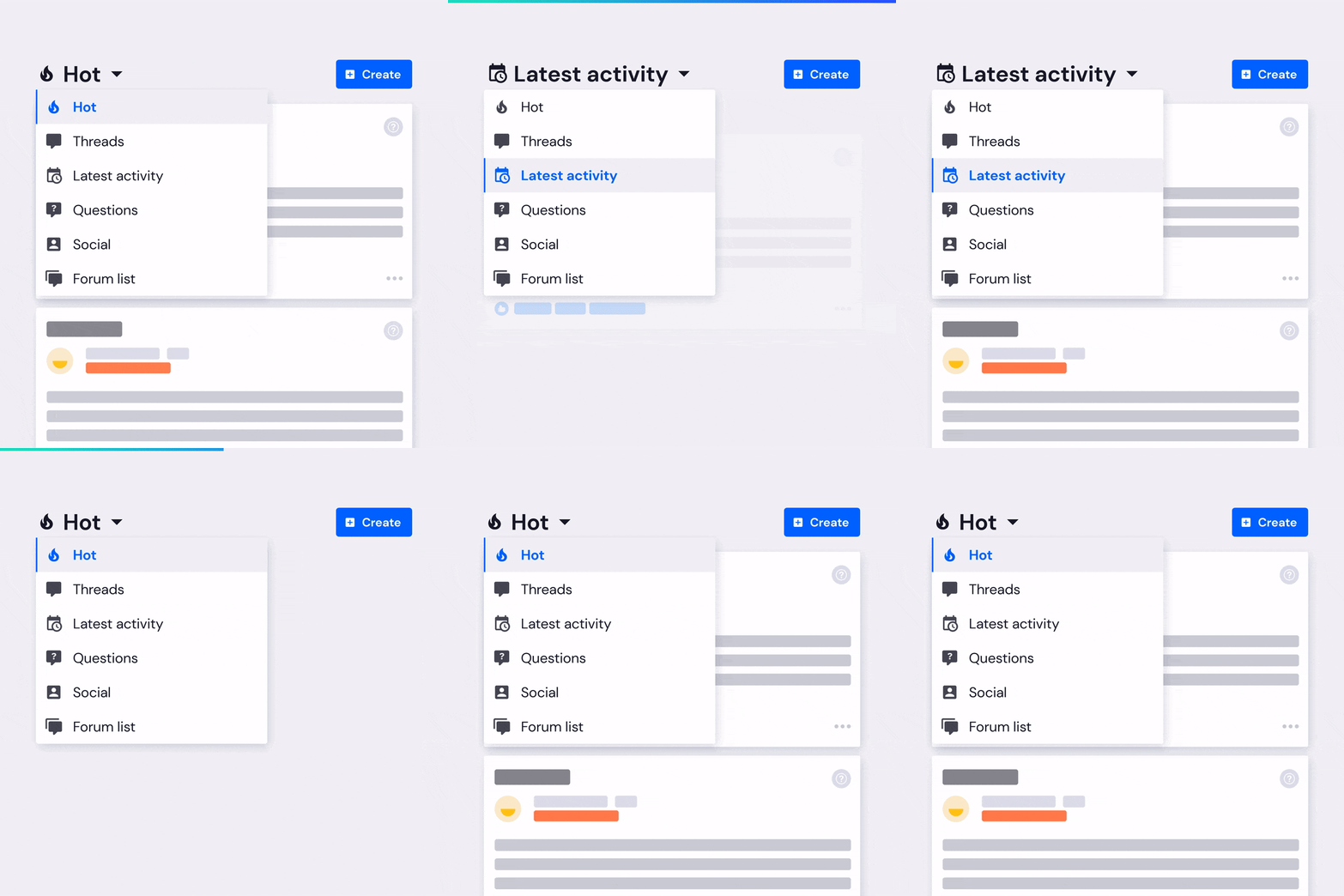
It should be noted that XenForo was one of the first of its kind to implement asychronous Javascript methodologies.
Filtering
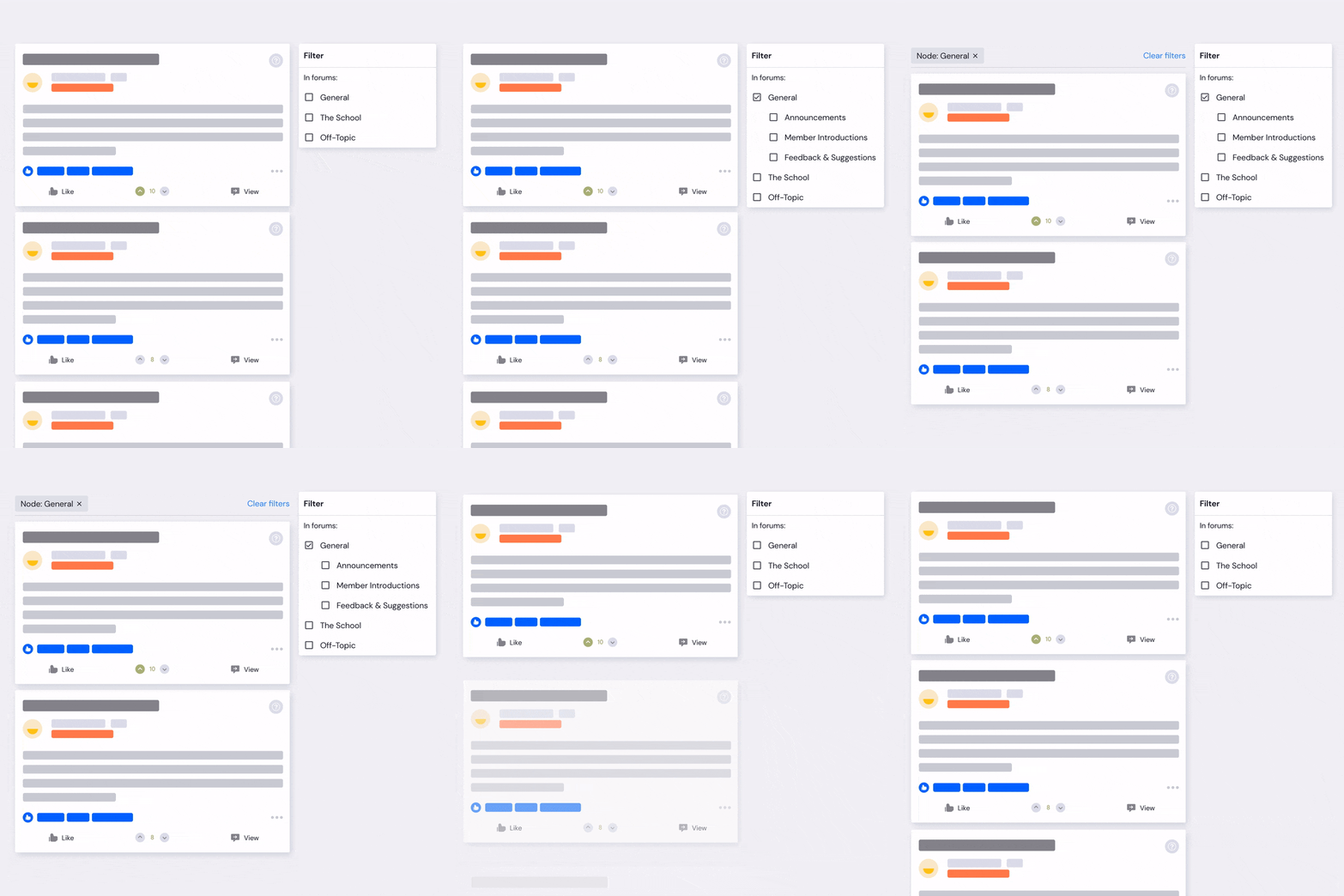
Users have a variety of filter options to allow users to drill down to the content they want to see (and the filters will save when navigating between feeds). All threads on forums, being neatly organized into folders and sub-folders, are a requirement of just about any forum. However, with this experience, it will not be an inhibiting factor in discovering content. This reduces clicks overall and should highlight content the user may have previously ignored.
Unread content indicator
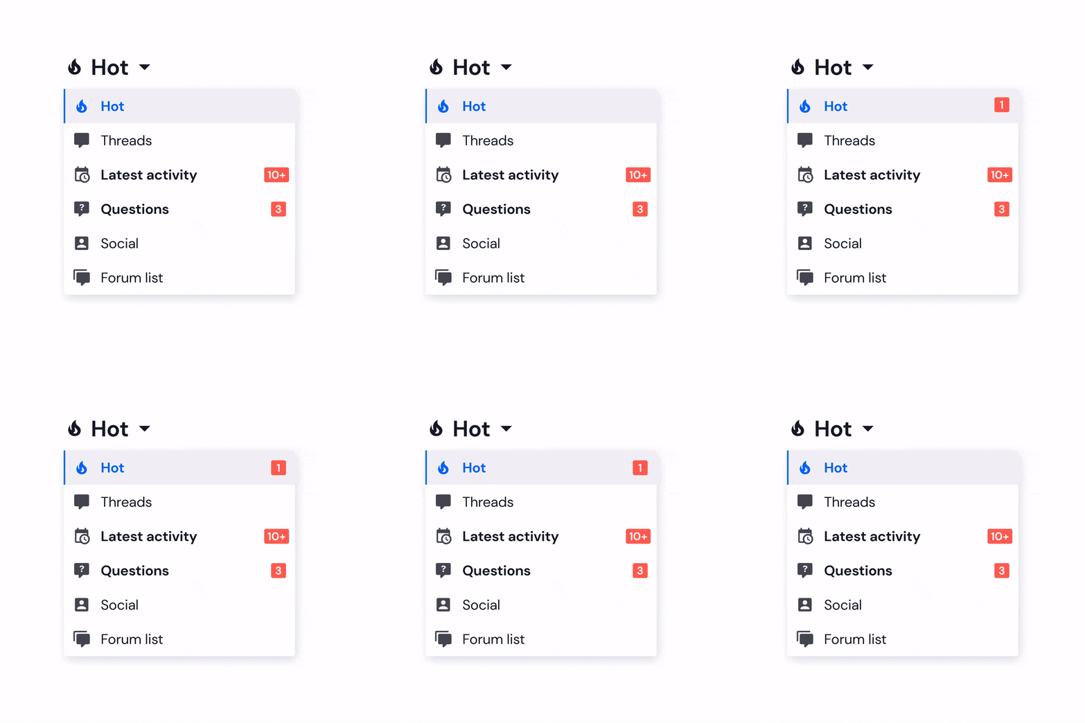
Each feed will have an indicator that shows if new, unseen content is present in the feed. This is standard across all experiences, but something we had to add in as each content type in each feed can vary. This also is not a perfect implementation, but give the diverse content types and different situations, was something we could be happy with for now and revisit or improve later.
In-feed content interaction

The ability to interact with content within the feed (reacting, upvoting, commenting, casting a vote) rather than needing to leave the feed and fully view the content to interact. Such a simple idea, but completely missing in just about every forum software we could find.
Improved mobile navigation

We intentionally consolidate 4–6 items with 1 of them being the navigation trigger. Put at the bottom on mobile as this is closer to the thumb. It may seem arbitrary, but we will likely do an entirely separate piece on this. For now, suffice to say that a lot of thought went into the idea of the ideal navigation experience across mobile, desktop, and app. We applied all of those ideals on this experience.
How has this worked in practice
When we started doing a site redesign and rebrand for Synner.com, we reconsidered what is best for the experience of the user. To do this, we looked at metrics across many of the forums we’re a part of and manage and determined the content that users are typically trying to see: trending content, newest threads, newest content of any type, questions, profile posts, and for some more traditional users the forum list. After deciding on the type of content that users want to see, we needed to determine what slows down the content creation process. As we mentioned earlier, at its core, what sets forums apart from social media platforms is content discoverability. When you visit Facebook or Instagram, you don’t need to navigate anywhere in order to find content and you don’t need to think about where you should create content. This can at times be confusing for users because they need to categorize what they’re creating, even if it may not perfectly fit in a single topic. This fact can deter content creation from occurring and drive down engagement on the site.
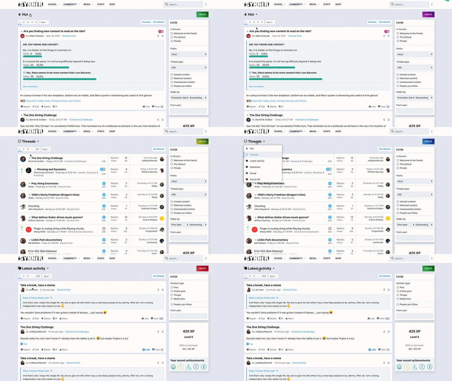
Now that the feeds system has been implemented on Synner, the site has:
- A strong community strategy focusing on the history of the community and its goals for growth in the future.
- An easy and intuitive user experience that helps new users to be easily onboarded and also helps all users to quickly create content and intuitively know where new content can be found.
- Dedicated community management for events, contests, support, and generally any user needs.
- A feeds system that is constantly up to date with the newest and most important content in the community.
In the future, they will have a streaming system which you can see more of here. Integrating their community account and streaming system, Synner members will have a seamless user experience and more ways to engage with the community. Synner will also have an app dedicated to the community, giving users a stronger mobile experience, which is extremely important since most users only visit the site on mobile and generally, more internet users are shifting to using their mobile devices rather than desktops for internet browsing.
Conclusion
Due to the purpose of community platforms, there are challenges to providing a simple user experience, particularly when compared to social media platforms. We have been working to solve the issue of forum structure and user experience for years and leveraged all of that experience when finding this “happy medium” solution.
Our feeds solution bridges the traditional forum experience and social media experience; giving users feeds that display new and interesting content they can engage with quickly, while also not straying too far from the traditional forum experience that users have come to expect.
We’re not done yet! Our team will continue to evaluate engagement levels, the user experience, and happiness on Synner so our solution evolves to provide the most benefit for them and other communities. We enjoy taking on challenges that will help bring people together and nurture successful communities so that the way we connect on the internet is productive and human. And we have exciting things brewing to do just that!
